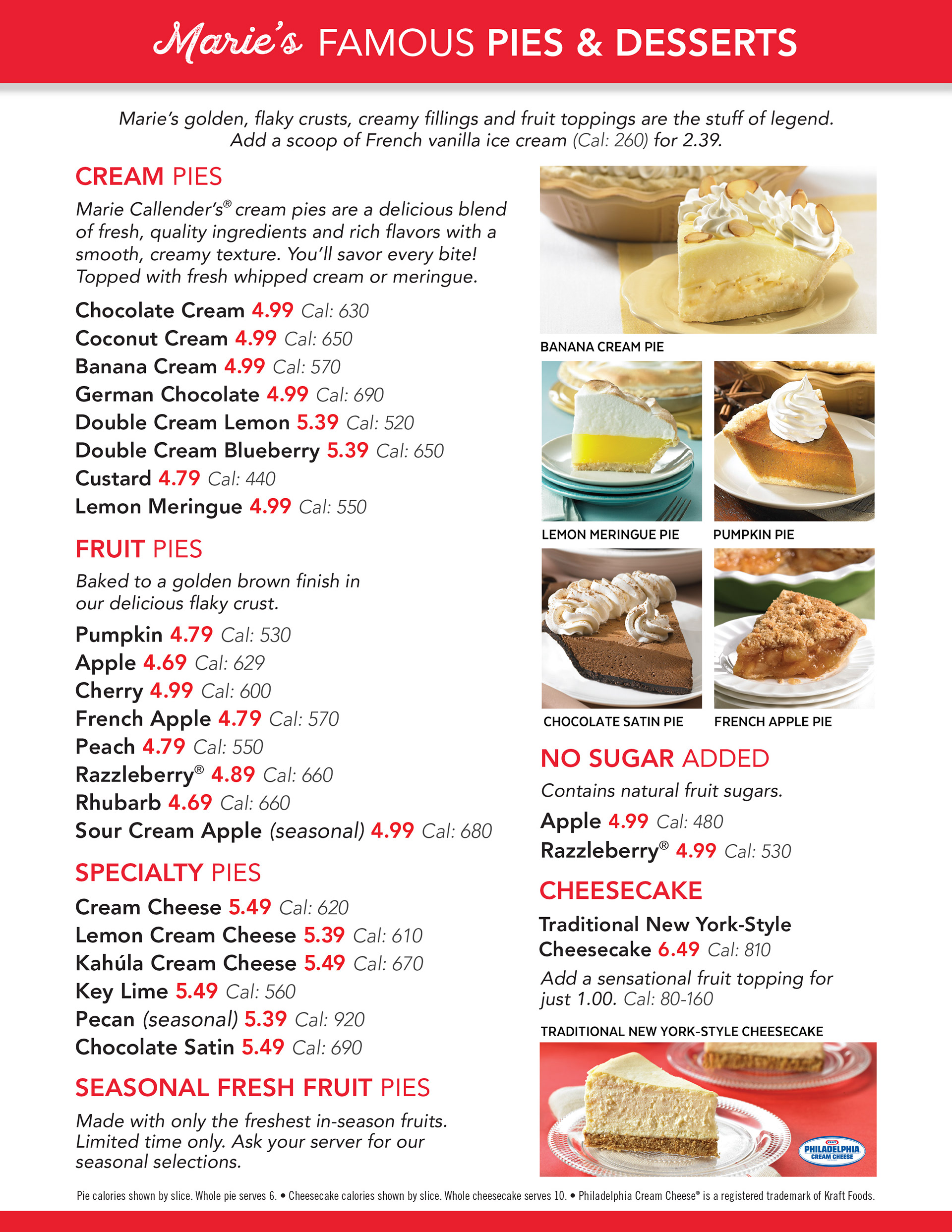

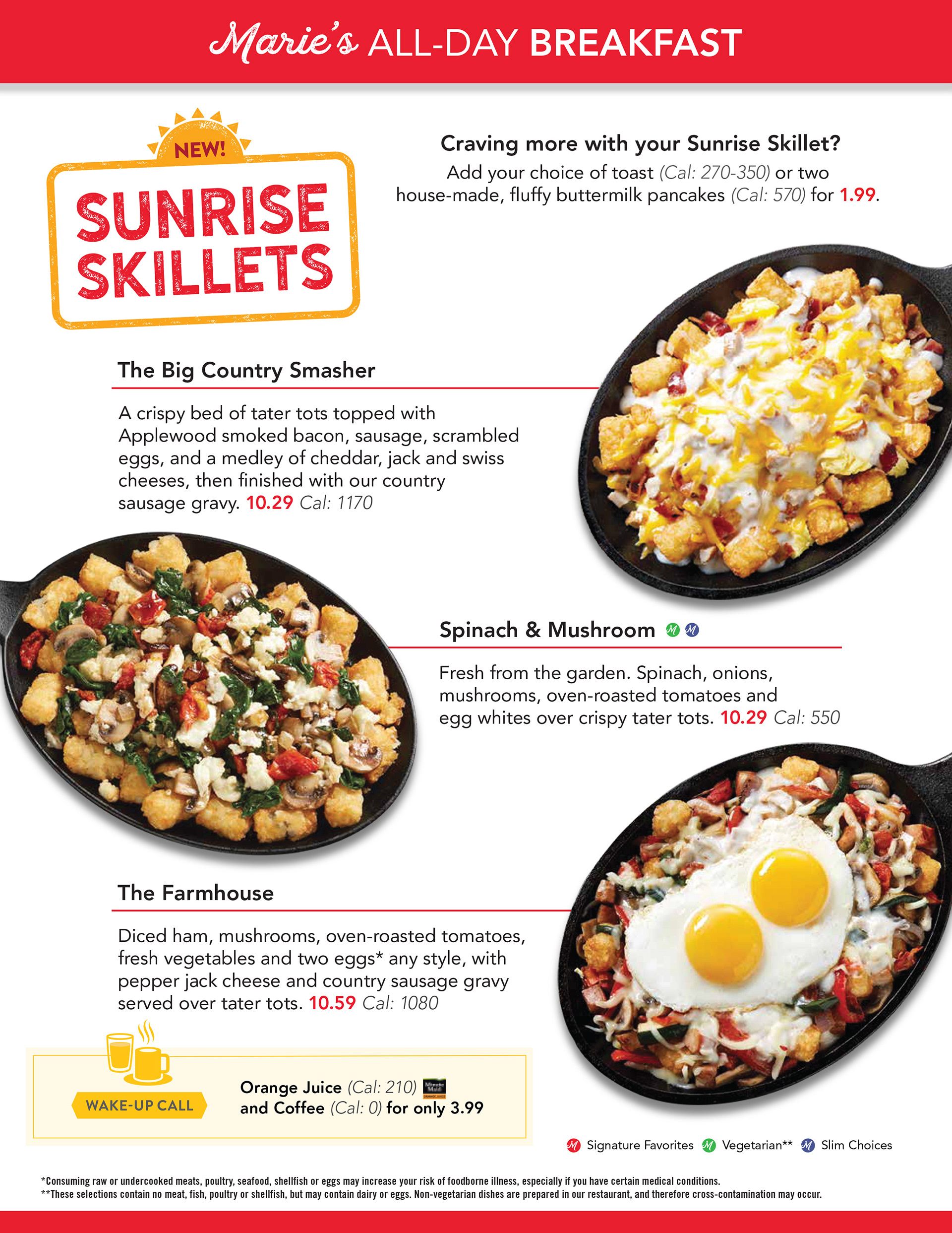
Marie Callender's Las Vegas Franchise | Menu Redesign
Brief: The first edition of menus developed for the Marie Callender's Las Vegas franchise years before I had been hired had become antiquated and was not properly balancing the copy and graphics featured.
The owner requested a redesign of all three kinds of specialty menus highlighting the signature red color of the Marie Callender's corporate branding, and that the pages featured a primarily white background to provide the owner the ability to print them in-house & reduce the cost of ink.
Solution: For the menu redesign, I took inspiration from the general layout of the Marie Callender's corporate menu, as well as their use of sans serif font and incorporation of images with transparent backgrounds to bring attention to certain food items.
I enhanced the amount of white space within each page to bring the cost of ink down/print time for the owner and featured the signature red of Marie Callender's corporate throughout the titles, prices, and header/footer to improve the organization and legibility of information for customers.
Tools Used: Adobe Illustrator & Photoshop
Featured in: Marie Callender's Las Vegas Franchise Restaurants
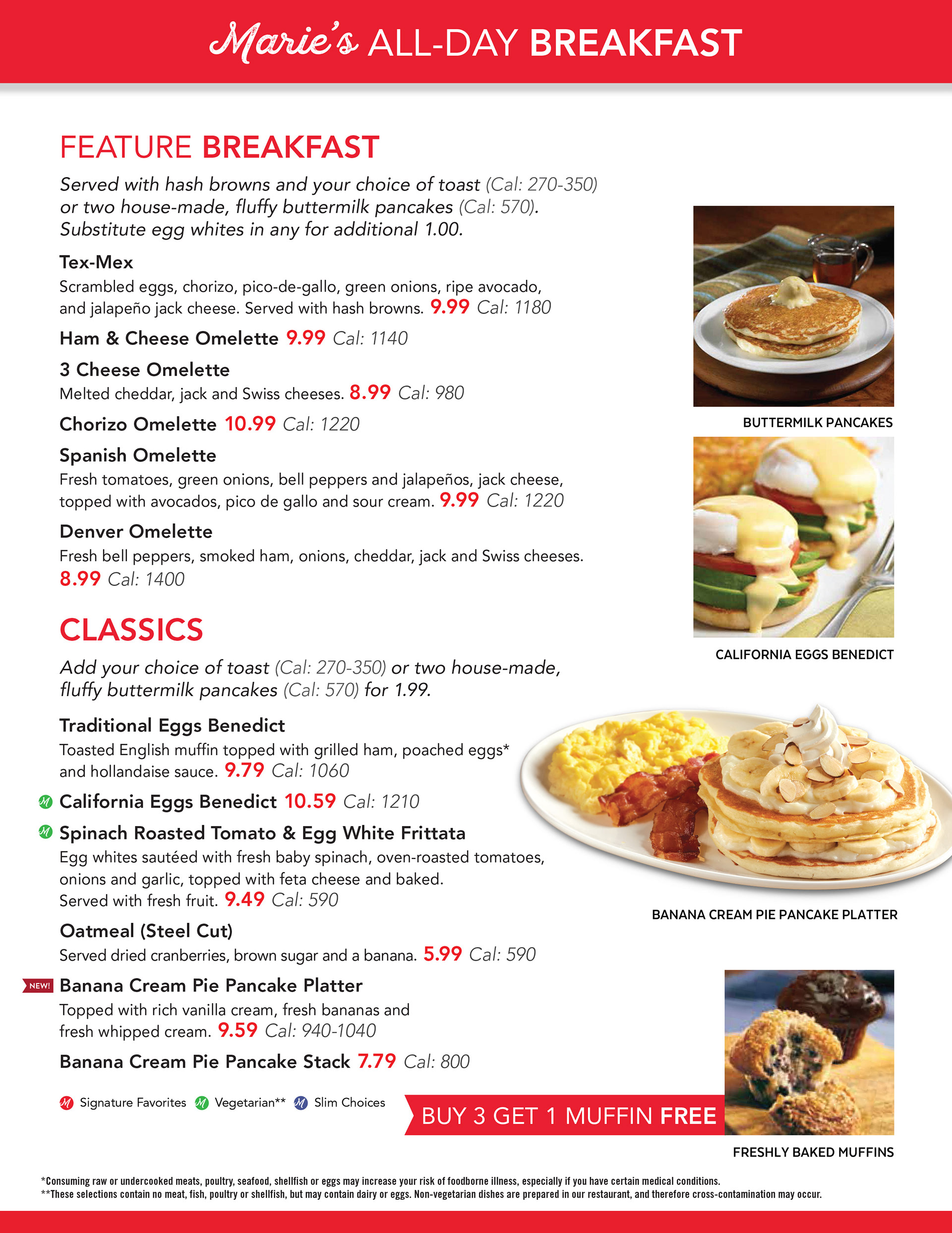
Marie Callender's Las Vegas Franchise | Breakfast Menu
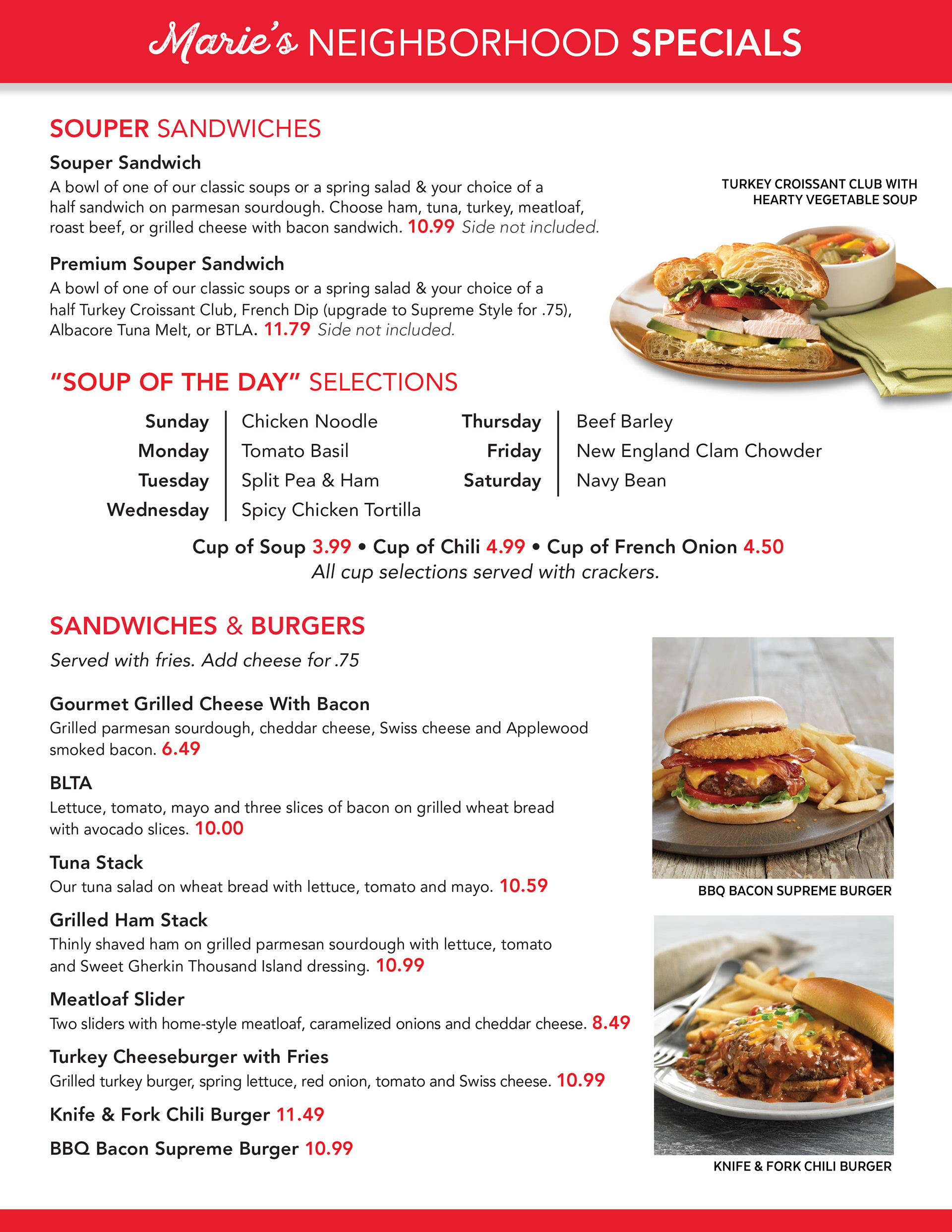
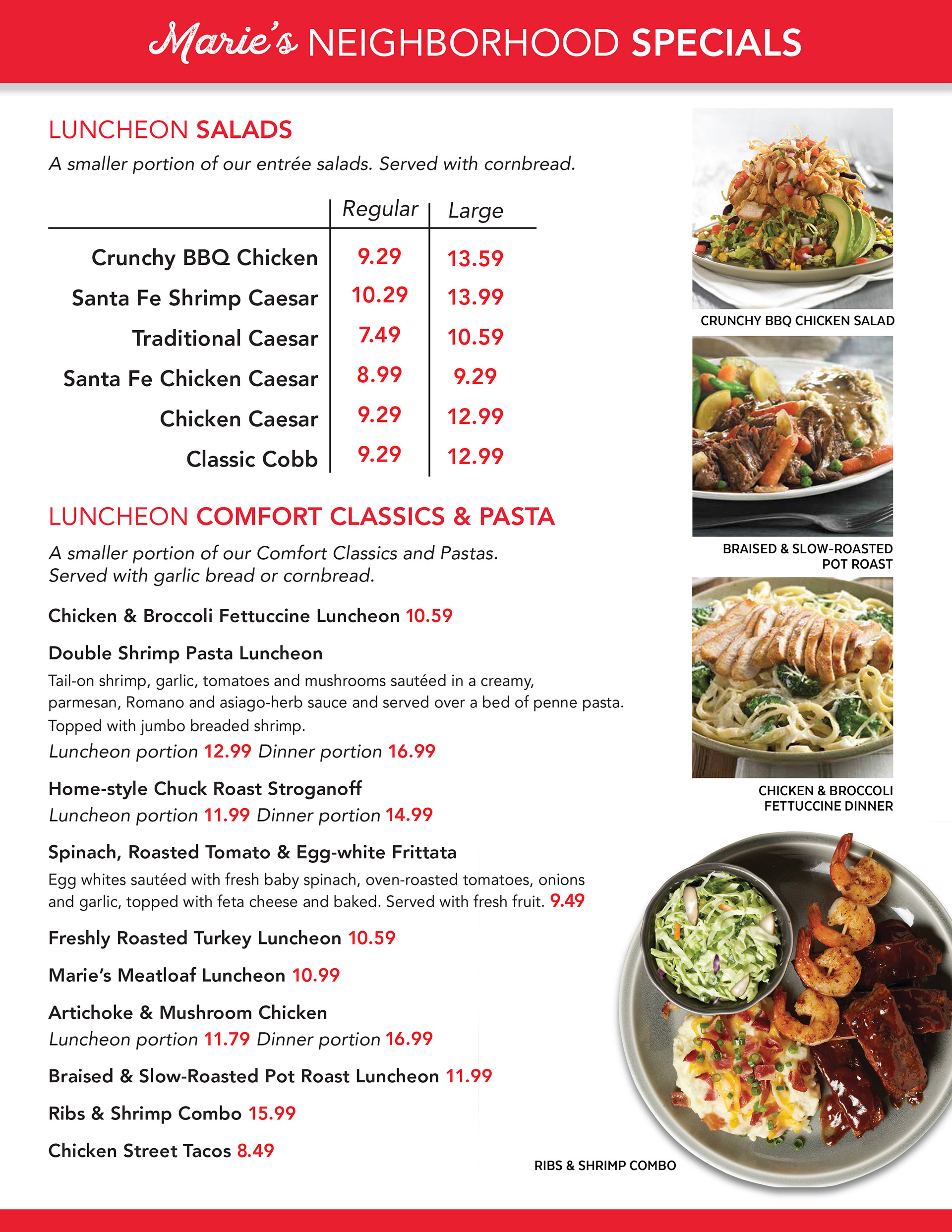
Marie Callender's Las Vegas Franchise | Neighborhood Specials Menu
Marie Callender's Las Vegas Franchise | Pies & Desserts Menu